Library: A Handwritten Font That Elevates Digital Branding
It started with a hero section. I was redesigning a boutique coaching website—clean layout, warm photography, soft color palette—and the headline just felt… flat. The current sans serif was legible, yes, but it lacked soul. So I swapped it out for Library, typed “Your Calm Starts Here,” and paused. Not because it looked unfinished—but because it suddenly *felt* intentional. Like the words had been written just for that visitor, not pulled from a font menu.
What Makes Library Feel So Human—Even on Screen
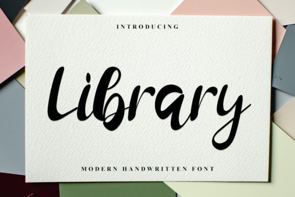
Library is a premium handwritten font from Script Amp, and it’s exactly what its description promises: neat, beautiful, and elegantly tactile. It’s not overly flourished or theatrical—it avoids the “calligraphy overload” that can distract in digital spaces. Instead, it carries quiet confidence: subtle entry and exit strokes, consistent letter spacing, and a gentle rhythm that mimics natural pen movement. There’s warmth in its curves, precision in its alignment, and timelessness in its proportions. As a web designer, I appreciate how it straddles authenticity and polish—no wobbly inconsistencies, no awkward joins. It reads like handwriting you’d trust, not mimicry you’d question.
How It Performs Where It Matters Most
I tested Library across real scenarios—not just mockups, but live previews on iOS, Android, and desktop Chrome. On a product landing page, it shined as a headline over a muted background image: crisp at 48px on desktop, still graceful at 36px on tablet, and surprisingly legible even at 28px on mobile—especially with sufficient contrast (I paired it with #2D2D2D on off-white). Its x-height is generous, and the lowercase ‘a’, ‘e’, and ‘o’ open cleanly, helping readability hold up under responsive scaling.
Where it truly earned its place was in emotional moments: the “Welcome” banner on a course sales page, the tagline above a testimonial carousel, the subtle accent text beneath a CTA button (“Start your journey →”). In each case, Library added quiet authority—not shouting, but inviting attention with sincerity. It doesn’t compete with imagery; it complements it. And unlike some script fonts, it doesn’t vanish into thin air on dark mode or low-resolution screens. I ran quick Lighthouse checks: no rendering delays, no FOIT/FOUT hiccups when loaded via @font-face with proper font-display: swap.
Where to Use It (and Where to Pause)
Library excels as a display font—not body copy. Think of it as your brand’s voice in key moments: hero headlines, section titles, quote callouts, logo lockups, and branded buttons (“Join the Circle”, “Get Your Guide”). It works beautifully in editorial-style blog headers, portfolio project names, and campaign banners where personality matters more than scanning speed.
But here’s what I learned through testing: avoid it for navigation links, form labels, small footer text, or anything under 18px in dense UIs. Its charm lives in breathing room—not tight grids. It’s also not ideal for auto-generated content (like dynamic blog post titles with inconsistent lengths) unless you’ve built in fallback logic and line-height tuning. And while it supports basic Latin characters well, double-check multilingual needs—accents and extended glyphs aren’t included in the base set, so verify if your audience requires broader language support before launching globally.
Pairing It Thoughtfully in Web Layouts
The magic of Library multiplies when paired intentionally. I consistently paired it with Inter (a highly readable, open-source sans serif) for body copy, captions, and interface text—and the contrast was immediate: human warmth meets functional clarity. For a more editorial feel—say, a creative agency blog—I swapped in IBM Plex Serif for subheads, letting Library anchor the top-level hierarchy without visual competition. No need for multiple weights of Library itself; it’s designed as a single, expressive style. That simplicity keeps loading light and implementation clean.
Script Amp delivers Library in WOFF2 format (optimized for web), plus OTF/TTF for design tools. Licensing is clear and commercial-friendly—no surprises when embedding in client sites or SaaS dashboards. Just confirm your use case aligns with their terms, especially for white-labeled platforms or template marketplaces.
Real-World Impact Beyond Aesthetics
On a recent portfolio site refresh, swapping a generic script for Library didn’t just change the look—it shifted how visitors described the brand in feedback: “thoughtful,” “approachable,” “crafted.” That’s not accidental. Typography shapes perception faster than any headline. Library signals care—not just in the words, but in how they’re presented. It tells users, “This wasn’t assembled. It was considered.”
For online store banners, it adds boutique-level distinction without sacrificing speed. For course sales pages, it softens the transactional tone and reinforces the personal promise behind the offer. Even in email subject lines (when used as web-safe fallbacks or image-based headers), its rhythm stands out in crowded inboxes.
If you’re choosing a font to represent your digital presence—not just fill space—Library earns its place not by being flashy, but by being quietly unforgettable. It’s the kind of typeface that doesn’t ask for attention… and ends up getting all of it.